Preparing professional Beverage Can Sleeve Artwork requires more than creating an attractive packaging design. Brands must consider printing specifications, can dimensions, colour accuracy, sleeve materials, product information, and finishing requirements before approving the final artwork. For beverage startups and established manufacturers, packaging plays a significant role in brand recognition and customer purchasing decisions. Moreover, well-designed sleeves help products stand out in competitive retail environments while communicating essential product details.
This process becomes especially important for energy drink brands. Bold graphics, distinctive colours, clear typography, and accurate product information can create a strong visual identity across different energy drink flavours. Therefore, beverage businesses should follow a structured artwork preparation process before sending their designs for commercial printing. This guide explains how to prepare accurate, professional, and print-ready beverage can sleeve designs while avoiding common packaging mistakes.
Why Beverage Can Sleeve Artwork Matters for Packaging
Packaging creates the first visual connection between a beverage brand and its customers. A professionally designed sleeve communicates the brand identity, product category, flavour, and important product information. Furthermore, accurate artwork preparation helps businesses reduce printing errors, material wastage, and unnecessary production delays.
A well-planned sleeve design offers several advantages:
- Stronger brand recognition: Consistent logos, colours, and typography help customers recognise products.
- Improved shelf visibility: Attractive graphics help beverages stand out among competing brands.
- Better product communication: Clear layouts make flavour names and product information easier to understand.
- Consistent packaging: Standardised artwork maintains visual identity across different beverage variants.
- Efficient printing: Accurate technical files reduce avoidable artwork corrections and reprints.
For energy drinks, packaging also communicates the product’s positioning. Consequently, brands should combine attractive visual elements with accurate product information and practical printing requirements.
Step 1: Understand Beverage Can Sleeve Artwork Specifications
Before designing the sleeve, collect the technical specifications from your packaging or printing supplier. Different can sizes, sleeve materials, and application methods require different artwork dimensions. For example, shrink sleeves need additional consideration because heat changes the shape of the film around the can. As a result, designers must account for possible artwork distortion during application.
First, confirm these details:
- Can diameter, height, and body dimensions
- Sleeve material and thickness
- Printing method and colour requirements
- Sleeve application process
- Required bleed and safe areas
- Seam and overlap allowance
- Shrink specifications, where applicable
- Final artwork format and submission requirements
Most importantly, request the latest production dyeline from your supplier. Avoid using estimated measurements or outdated templates because even small dimensional differences can affect sleeve alignment.
Beverage Can Sleeve Artwork and Dieline Preparation
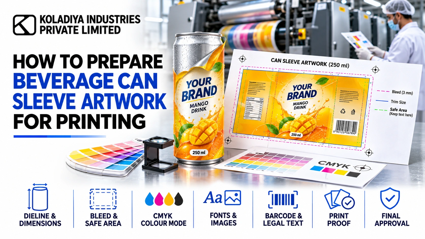
A dieline provides the technical template for your packaging design. It identifies the printable area, cutting boundaries, safe zones, and other production instructions.
Keep important elements such as logos, product names, barcodes, and mandatory declarations within the recommended safe area.
Additionally, shrink sleeve designs may require distortion compensation. Ask your printer to identify areas where artwork adjustments will help graphics and text appear correctly after shrinking.
Step 2: Create a Strong Brand-Focused Design
An effective can sleeve should communicate the product identity quickly. Therefore, arrange the design elements according to their importance.
Start with the following components:
- Brand logo and product name
- Beverage category and flavour
- Brand colours and typography
- Product-specific illustrations
- Key product features
- Required product and regulatory information
However, avoid overcrowding the design. Too many graphics, colours, and promotional messages can make the packaging difficult to understand.
Instead, establish a clear visual hierarchy. Give the brand name sufficient prominence, use readable typography, and maintain enough space between individual design elements.
Furthermore, maintain consistency across different beverage flavours. You can introduce flavour-specific colours and illustrations while retaining the same logo placement and overall design structure.
Beverage Can Sleeve Artwork for Energy Drinks
Energy drink packaging needs a distinctive visual identity because brands compete for attention in a crowded beverage market.
Consider these design elements when developing energy drink sleeves:
Bold typography: Use strong, readable lettering to make the brand name and product identity noticeable.
Distinctive flavour colours: Apply suitable colours and graphics to differentiate citrus, berry, tropical, and other flavour variants.
Dynamic illustrations: Use energetic patterns, abstract graphics, or flavour-related visuals to reinforce the product’s positioning.
Functional messaging: Highlight relevant product characteristics without overcrowding the available space or using unsupported claims.
Consistent can presentation: Maintain a recognisable identity across 250 ml aluminium slim cans and other selected packaging formats.
Ultimately, the design should balance visual appeal, readability, and practical printing requirements.
Step 3: Select the Correct Colours for Printing
Colours often appear different on digital screens and printed packaging. Designers generally use RGB for digital displays, whereas commercial printers commonly require CMYK or specific spot-colour configurations. Therefore, confirm the printer’s colour specifications before finalizing the artwork.
Follow these practices:
- Convert colours according to the printer’s requirements.
- Confirm brand colours and spot-colour references.
- Review gradients, shadows, and colour transitions.
- Check whether the design needs a separate white-ink layer.
- Consider how the sleeve material affects colour appearance.
- Request a colour proof when accurate brand matching matters.
For instance, energy drink brands often use black, red, blue, silver, and vibrant accent colours. Nevertheless, sleeve material, printing technology, and surface finishes can influence the final appearance. Moreover, transparent films may require an opaque white-ink layer beneath selected graphics. Without suitable white backing, certain colours may appear less vibrant or lose visibility.
Step 4: Prepare High-Resolution Images and Graphics
Image quality directly affects the finished packaging. Low-resolution graphics can look blurred or pixelated after printing.
Whenever possible, use vector graphics for logos, illustrations, icons, and typography. Vector files maintain their sharpness when designers resize them.
For photographic images, prepare suitable high-resolution files at the intended output size. Approximately 300 PPI often works well for detailed packaging images, although the printing supplier should confirm the actual requirement.
Before submission, check the following:
- Use high-quality images and illustrations.
- Maintain consistent logo dimensions.
- Check typography and font readability.
- Embed or package linked image files.
- Confirm image placement and proportions.
- Avoid unnecessary effects that reduce print clarity.
Beverage Can Sleeve Artwork File Setup
Organise your artwork into clearly labelled layers. Keep the design, dielines, technical notes, and special printing elements separate wherever the printer requires them.
For example, white ink, varnish, and special finishes may need separate layers or colour separations.
Additionally, convert fonts to outlines when the printer requests this format. However, retain an editable source file so your team can update flavour names, product information, and other artwork elements later.
Step 5: Check Bleed, Safe Areas, and Seam Placement
Bleed prevents unwanted unprinted edges after trimming. Extend background colours and graphics into the required bleed area according to the approved dieline.
In contrast, the safe area protects essential information from trimming, distortion, and overlap.
Pay particular attention to these elements:
Logo placement: Keep your brand logo in a prominent and easily visible position.
Product information: Position flavour names and descriptions where customers can read them comfortably.
Barcode placement: Follow the supplier’s requirements for barcode dimensions, contrast, and quiet zones. Test the finished barcode for scanning accuracy.
Seam allowance: Keep important information away from the sleeve joining area.
Can curvature: Review the design across the curved surface instead of evaluating only the flat artwork.
These precautions help improve packaging alignment and reduce avoidable printing problems.
Step 6: Add Accurate Beverage and Energy Drink Information
Packaging artwork must communicate product information accurately. Before approving the design, compare every detail with the final product formulation and approved label documentation.
For energy drinks, review:
- Product name and beverage category
- Flavour description
- Ingredient information
- Nutritional information
- Caffeine declaration, where applicable
- Serving size and net quantity
- Manufacturer or marketer details
- Batch and date-related declarations
- Applicable warnings and regulatory information
For products sold in India, check the applicable FSSAI labelling requirements before sending the artwork for printing.
Additionally, avoid unsupported health, nutritional, or performance claims. Verify every statement against the approved formulation and relevant product documentation.
Accurate labelling strengthens brand credibility while helping businesses prepare packaging for commercial requirements.
Step 7: Choose Suitable Printing Finishes
Printing finishes influence the overall appearance and presentation of beverage packaging. Depending on the design and available printing technology, brands can consider:
- Gloss finishes
- Matte finishes
- Metallic effects
- Special varnishes
- Transparent design elements
- Selected texture effects
However, choose finishes according to the brand’s positioning, budget, and technical compatibility.
For example, an energy drink brand may use metallic effects or selected glossy elements to highlight its logo and major graphics. Nevertheless, maintain sufficient contrast so customers can easily read important product information.
Step 8: Approve a Printed Sample Before Bulk Production
A digital preview cannot fully represent the finished sleeve. Printing materials, colour variations, lighting, shrink behaviour, and application conditions can influence the final appearance.
Therefore, request a printed proof or production sample before approving a bulk order.
During the sample review, check:
- Logo size, positioning, and colour consistency.
- Product name and flavour readability.
- Sleeve alignment around the can.
- Barcode scanning performance.
- Seam position and overlap.
- Text clarity and regulatory details.
- Colour appearance after sleeve application.
- Material quality and finishing.
For shrink sleeves, inspect the artwork after the normal application process. This step helps identify distortion, wrinkles, and alignment issues that a flat proof may not reveal.
Once the sample meets the agreed specifications, provide formal approval for production.
Common Beverage Can Sleeve Artwork Mistakes to Avoid
Even experienced beverage brands can overlook important packaging details. Fortunately, a structured artwork review helps prevent many common problems.
| Common mistake | Recommended solution |
|---|---|
| Incorrect can dimensions | Use the latest printer-approved dieline. |
| Missing bleed | Extend background artwork as specified. |
| Incorrect logo placement | Follow the recommended safe areas. |
| Low-resolution images | Use suitable high-resolution or vector graphics. |
| Incorrect colour settings | Confirm CMYK, spot colours, and white-ink requirements. |
| Overcrowded design | Prioritise the logo, product name, and essential details. |
| Incorrect seam positioning | Keep important information away from the seam. |
| Skipping sample approval | Review an applied printed sample before bulk production. |
| Outdated product details | Match the artwork with the final approved formulation. |
By addressing these mistakes early, beverage businesses can minimise unnecessary reprints, improve packaging consistency, and support more efficient production planning.
How Koladiya Industries Supports Beverage Brand Development
Launching a successful beverage brand requires coordination between product formulation, packaging decisions, manufacturing specifications, and brand positioning.
Koladiya Industries Private Limited works in beverage manufacturing and provides support across beverage formulation and R&D, private-label manufacturing, and third-party beverage production.
The company’s beverage categories include:
- Energy drinks
- Carbonated soft drinks
- Sparkling water
- Tonic water
Koladiya Industries also has packaging expertise in 250 ml aluminium slim cans.
For businesses planning an energy drink launch or developing a new beverage concept, packaging decisions should align with the selected formulation, can format, product information, and manufacturing requirements.
Consequently, brands should coordinate their artwork specifications and printing approvals with the relevant packaging and manufacturing partners before commercial production.
Conclusion: Prepare Beverage Can Sleeve Artwork for Successful Printing
Preparing professional Beverage Can Sleeve Artwork requires careful attention to dimensions, design, colour accuracy, image quality, product information, and printing specifications. From selecting the correct dyeline to approving a printed sample, every step contributes to the final packaging quality. Moreover, a structured preparation process helps minimise artwork errors, avoid unnecessary expenses, and maintain consistent branding. For energy drink startups and established beverage companies, an attractive and technically accurate sleeve can strengthen brand recognition and improve product presentation.
Start Your Beverage Manufacturing Journey with Koladiya Industries
Planning to launch an energy drink, carbonated soft drink, sparkling water, or another beverage product? Partner with Koladiya Industries Private Limited for beverage formulation and R&D, private-label manufacturing, and third-party beverage production solutions. Contact Koladiya Industries today to discuss your beverage concept, formulation requirements, packaging format, and commercial manufacturing plans. Take the next step towards building a distinctive beverage brand with the right manufacturing partner.